
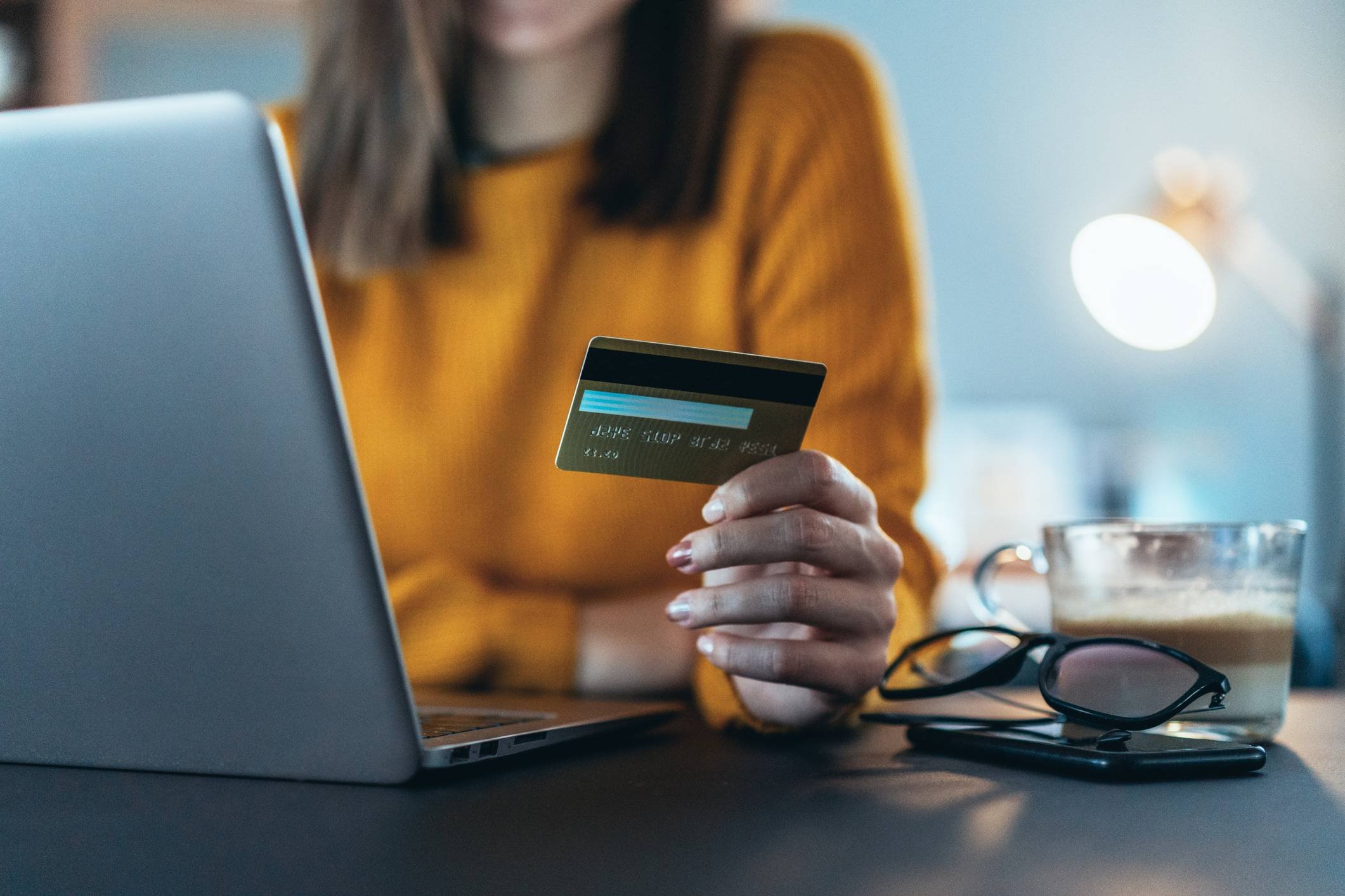
Enhancing a cashback system and designing their first mobile app
About the Project
Overview
While running my studio, I frequently collaborated with various Brazilian startups. Meu Dim Dim approached me seeking assistance with their plans to develop an app, as they were experiencing challenges with their website's usability and information architecture.
The challenge
Meu Dim Dim's goal was to develop an app version of their system, thus, they were facing a scenario where they already had a good market share, and a platform that was running out, but the user adoption at that time wasn’t going well, people were leaving the flow without completing tasks, and before developing the app I needed to understand why this was happening with the website.
Discovery
Exploratory research
Through a website called Reclame Aqui, I was able to understand the current Meu Dim Dim problems given by real users:
The deadlines for receiving the money from the transactions were not clear, there were no standards, and no messages were informed about it.
The deadlines end and the payment is not executed correctly.
The stores do not pay what is promised at the beginning.
Cashback has been canceled without giving any reason.

Quantitative Research
To learn more about cashback, I conducted a survey with a group of 12 people who use cashback.
The survey included simple questions about usage, preferred apps, problems, and whether they had heard of Meu Dim Dim.

Conclusion
The responses highlight the lack of information, warnings, and support. and the urgent need. In addition, all the users interviewed never heard about Meu Dim Dim, so it opens a great opportunity to invest more in marketing and promotion to promote the brand and the product.
Heuristic analysis
A heuristic analysis was performed to identify potential usability issues with the Meu Dim Dim website.
Problems found
Inconsistent components, typographies, and spacing between elements.
Main navigation with hidden pages and poor brand attraction.
Lack of communication and user support.
Too many ads and pop-ups come from nowhere.

Benchmarking
Benchmarking was done with key competitors to identify opportunities for developing new features, improving current features that competitors were doing much better, and fixing bugs that were impacting the user flow to complete the product goal.
Benchmarking insights
After collecting all possible information about Meu Dim Dim, we were able to come up with some insights:
A FAQ with the main questions and answers would meet the basic needs of users.
A support chat or phone would add great value to the product.
Improving the content and information in the critical steps would make the user more confident and worry-free.
Improving UI components and basic interface heuristics would bring more clarity to the site.
Improving the main navigation to highlight pages would enhance the user experience.
Eliminating pop-ups and introducing a new idea for displaying promotions elsewhere would improve the site experience.

Ideation & Definition
Information architecture
Once we understood real user needs and mapped the product requirements for the app, we defined the information architecture of the entire app.

Wireframes and usability test
After the sitemap was ready, I designed the navigable wireframes to test them with the end users.
Overall, the usability test was well received, with a few suggestions for improvement that were prioritized:
Show the user how many people activate a particular cashback, this would involve an emergency need to increase the number of users activating cashback.
Improve the taxonomy of the main cashback button, instead of "click here to" it should say "activate cashback and go shopping".
When uploading tax coupons, where the user needs to upload the coupon, and the "Open camera to take a picture" feature should be used; today there is no such option.

Prototype
Onboarding flow
The onboarding is an important first step for users who do not know what cashback is, now the product is better introduced to the user and they can have a comprehensive understanding of the basics of what They could do with cashback.

Product pages
With new hierarchy improvements and engaging features coming up, the understanding of sections and products to acquire was much clearer and easier to find;

Detailed cashback information
For the internal pages about Cashback, we focused on improving the information architecture and making the content clear enough to make every step and link understandable. I also designed a new identity for the message types, so that the user now has visual support to understand the content of the message.

Conclusion
Results
After a year, I returned to the Reclame Aqui website to see how Meu Dim Dim's reputation was doing, and since I delivered the entire project, Meu Dim Dim's average reputation was looking pretty much better.
KPIs validation
After all the changes, we were able to check the success metrics definition, and we had a pleasant conclusion:
35% of users’ conversion after completing the onboarding process.
28% of new users after the release of the new platform.
The team was not able to measure this KPI yet.
